HSBC Bank
User Research, UX+UI Product Design
Using research, big data, prototyping to solve issues in a banking legacy system
How users look at your websites?
In order to validate the best design approach for the HSBC insurance portal, I carried out some UX research and Usability testing on high fidelity wireframes during my design sprints. Below are some of the result of that research:
With billions of online offers competing for eye-balls, it’s common to lose over half of your visitors within the blink of an eye. If users can’t find what they are looking for within seconds, they’re gone. What’s the secret of successful websites then? Users need to immediately see why they should stick around – your offer, its benefits and a clear call-to-action.
Perception map
This Perception Map shows what users will see on your website within the first few seconds of opening the page. Your offer’s main benefits and a clear call-to-action must stand out to improve usability and conversion rates.
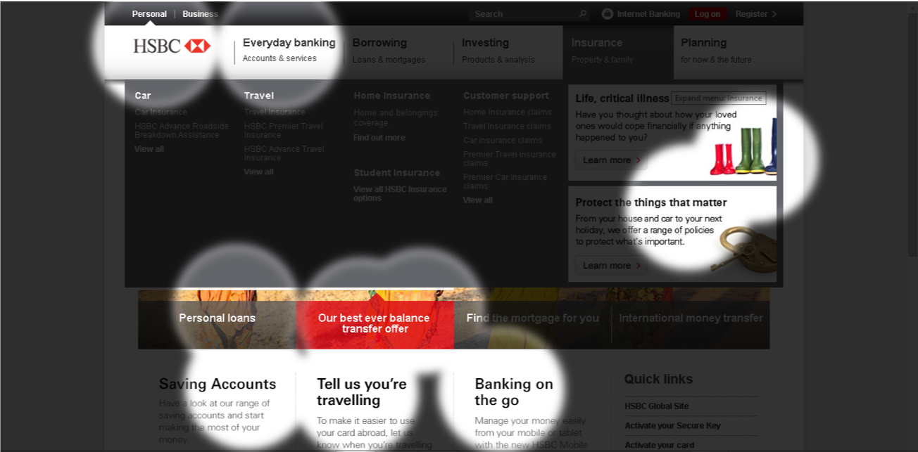
New user
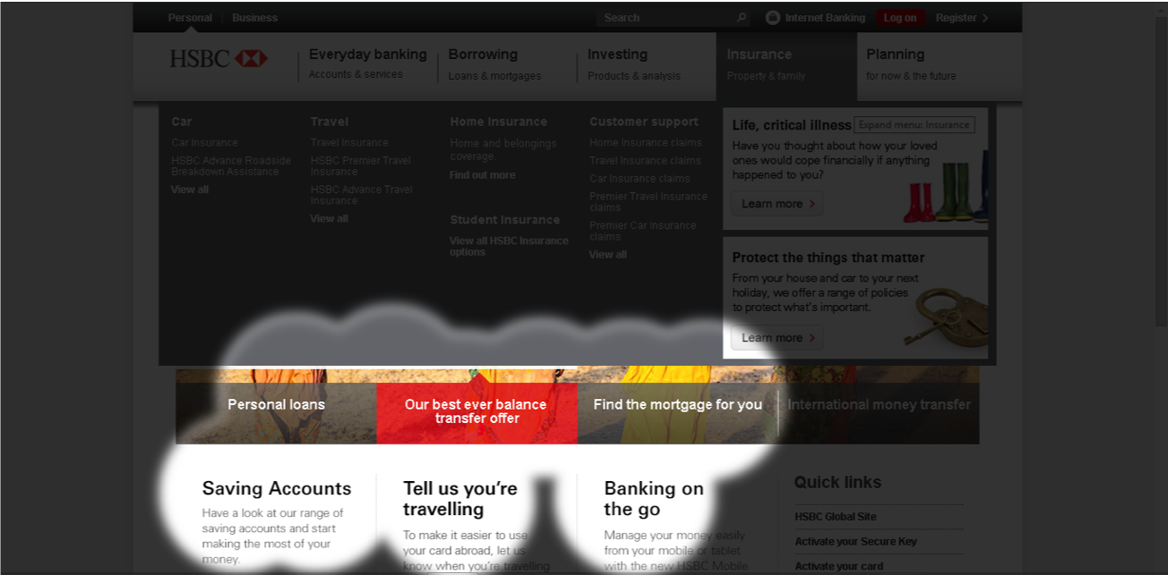
Engaged user
Attention (Heat) map
Users only have so much attention to give your website. This attention map shows visually how that attention is distributed across pages. These results allow for a fine-tuning of the website’s most important design elements and layout to ensure that the “attention budget” is spent wisely.
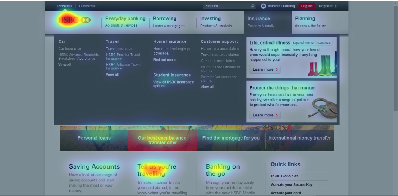
New user
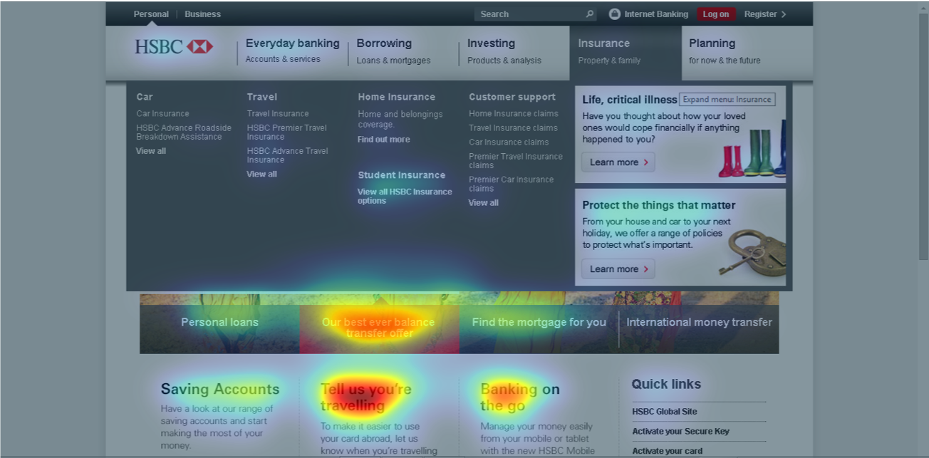
Engaged user
Hot spot map (New visitor)
The Hot Spot Map combines the Attention and Perception Map’s information in one global view: the bigger the circles, the more eye-catching the underlying elements. More than one circle on one element indicates that the area will most probably be viewed several times – even in the orientation phase.
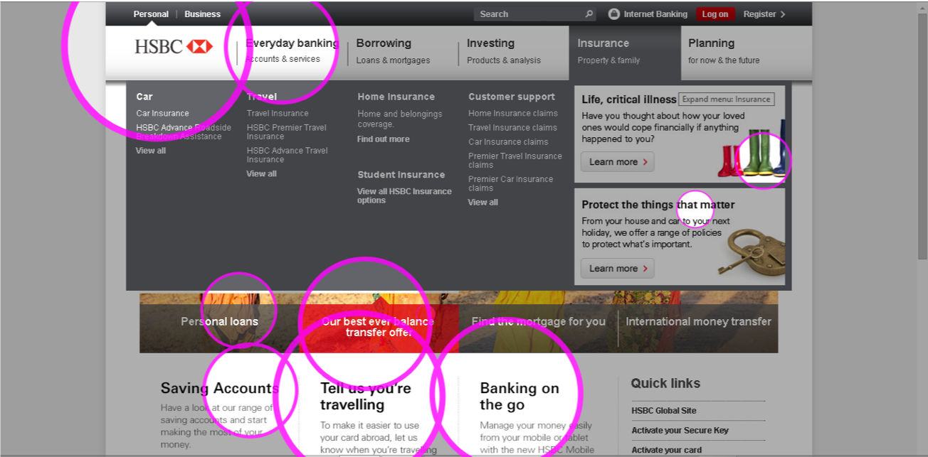
New user
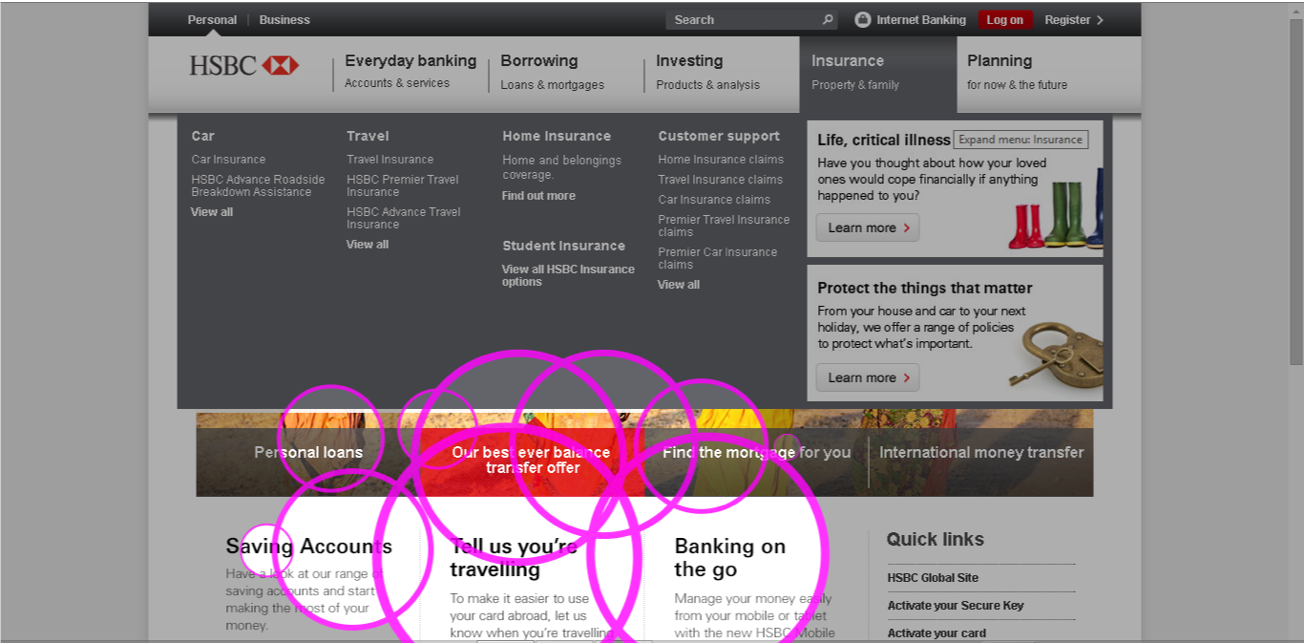
Engaged user
How will users navigate the site?
Remote and Onsite card sorting
We needed to validate the mental model of typical Insurance buying personas. How do they see things? How would they locate things? Instead of assuming the content organisation/strategy, We asked the users directly, using card sorting, field studies.
We divided the exercise into two; firstly asking the users to write/type in what they thought should be on the cards when they think of buying insurance. Then collected this cards digitally, and in the second phase asked them to sort them into groups. With that data, we developed :
Dendrograms
Similarity matrix
Tree jacks
At HSBC I worked with a great UX team in this and other projects namely:
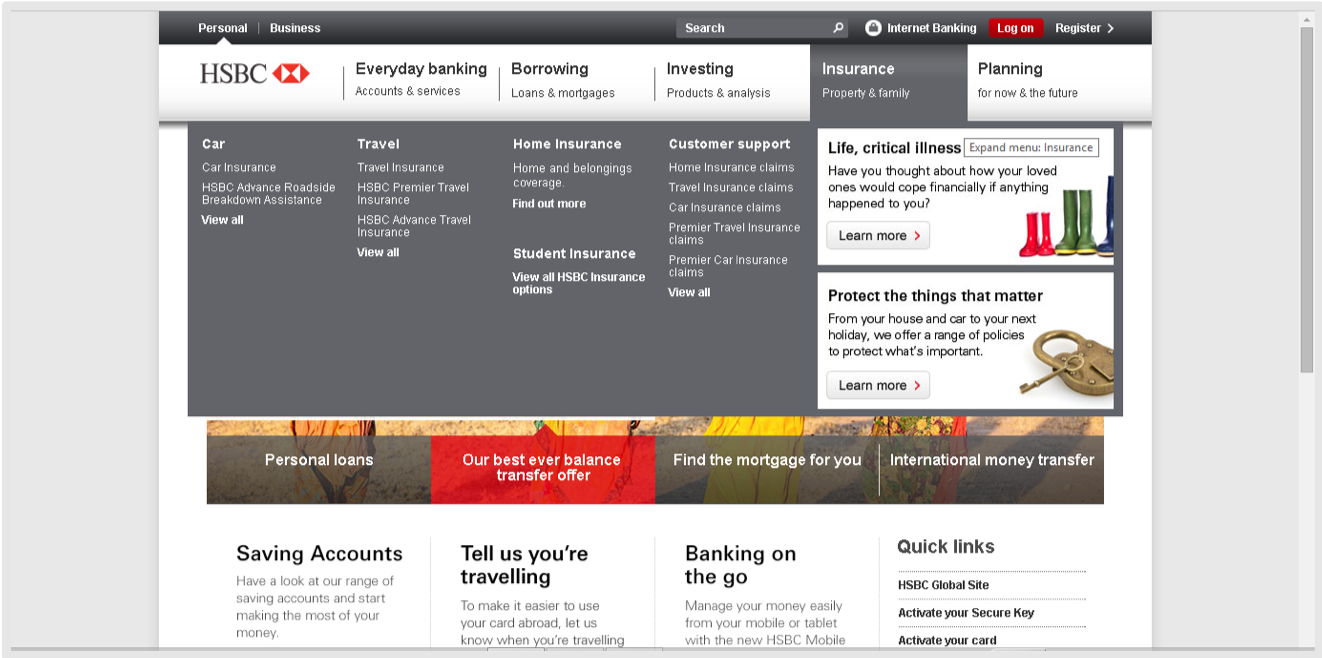
High fidelity wire
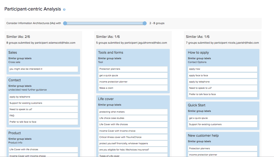
Cards
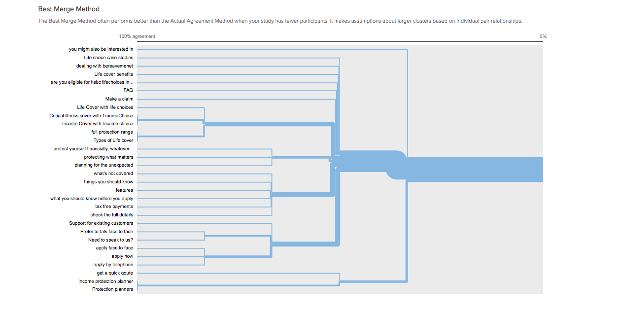
Dendrogram
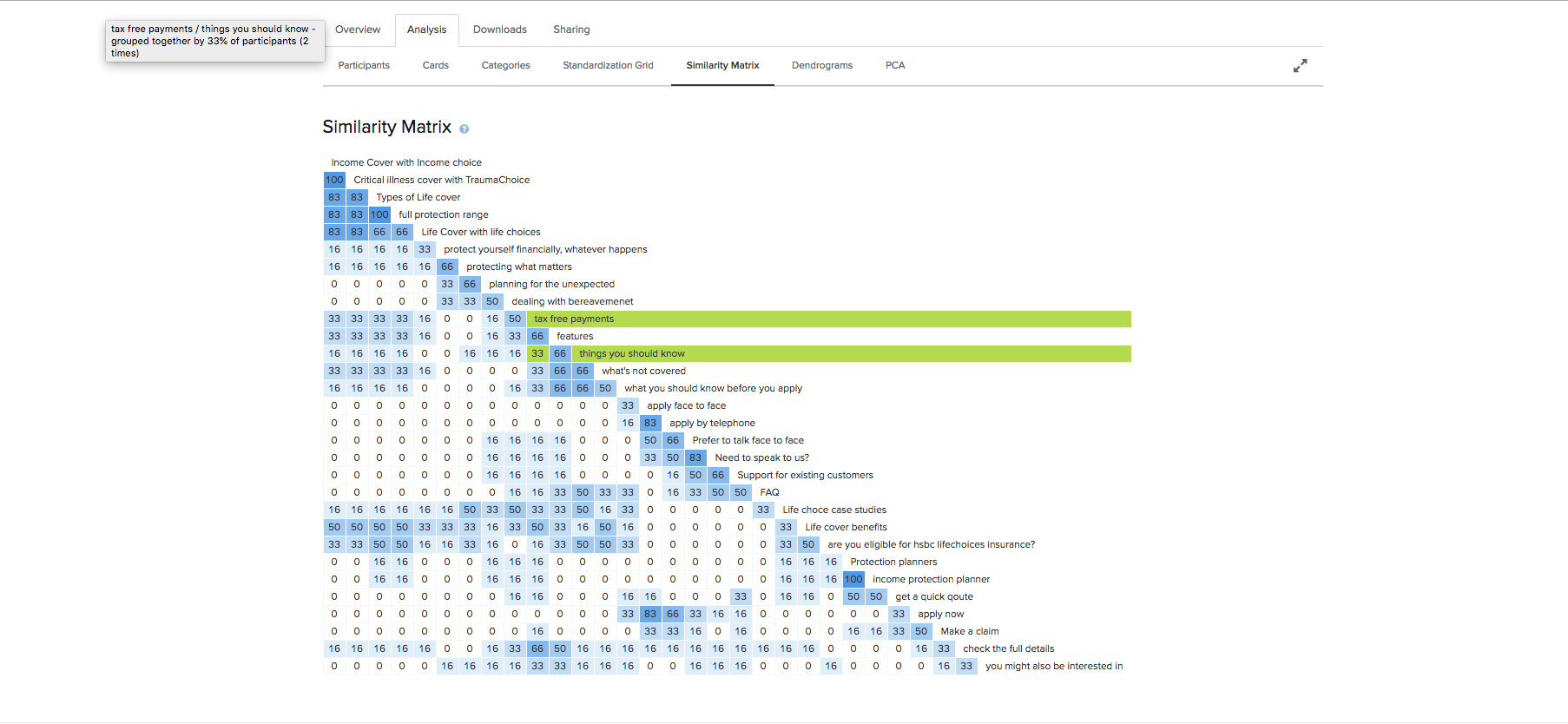
Similarity matrix- mental modeling
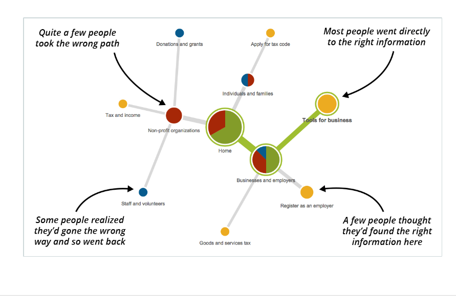
Tree jacks
Interactive prototype used in testing
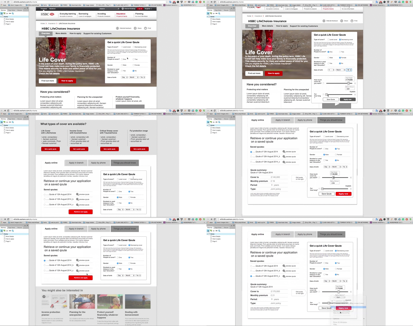
Interactive prototype used in testing
